• Pl chevron_right

      Jussi Pakkanen: Multi merge sort, or when optimizations aren't

      news.movim.eu / PlanetGnome • 17 April 2026 • 2 minutes

    In our previous episode we wrote a merge sort implementation that runs a bit faster than the one in stdlibc++. The question then becomes, could it be made even faster. If you go through the relevant literature one potential improvement is to do a multiway merge. That is, instead of merging two arrays into one, you merge four into one using, for example, a priority queue.

    This seems like a slam dunk for performance.

    • Doubling the number of arrays to merge at a time halves the number of total passes needed
    • The priority queue has a known static maximum size, so it can be put on the stack, which is guaranteed to be in the cache all the time
    • Processing an element takes only log(#lists) comparisons
    Implementing multimerge was conceptually straightforward but getting all the gritty details right took a fair bit of time. Once I got it working the end result was slower. And not by a little, either, but more than 30% slower. Trying some optimizations made it a bit faster but not noticeably so.

    Why is this so? Maybe there are bugs that cause it to do extra work? Assuming that is not the case, what actually is? Measuring seems to indicate that a notable fraction of the runtime is spent in the priority queue code. Beyond that I got very little to nothing.

    The best hypotheses I could come up with has to with the number of comparisons made. A classical merge sort does two if statements per output elements. One to determine which of the two lists has a smaller element at the front and one to see whether removing the element exhausted the list. The former is basically random and the latter is always false except when the last element is processed. This amounts to 0.5 mispredicted branches per element per round.

    A priority queue has to do a bunch more work to preserve the heap property. The first iteration needs to check the root and its two children. That's three comparisons for value and two checks whether the children actually exist. Those are much less predictable than the comparisons in merge sort. Computers are really efficient at doing simple things, so it may be that the additional bookkeeping is so expensive that it negates the advantage of fewer rounds.

    Or maybe it's something else. Who's to say? Certainly not me. If someone wants to play with the code, the implementation is here . I'll probably delete it at some point as it does not have really any advantage over the regular merge sort.

    • Pl chevron_right

      This Week in GNOME: #245 Infinite Ranges

      news.movim.eu / PlanetGnome • 17 April 2026 • 4 minutes

    Update on what happened across the GNOME project in the week from April 10 to April 17.

    GNOME Core Apps and Libraries

    Libadwaita

    Building blocks for modern GNOME apps using GTK4.

    Alice (she/her) 🏳️‍⚧️🏳️‍🌈 reports

    AdwAboutDialog ’s Other Apps section title can now be overridden to say something other than “Other Apps by developer-name

    Alice (she/her) 🏳️‍⚧️🏳️‍🌈 announces

    AdwEnumListModel has been deprecated in favor of the recently added GtkEnumList . They work identically and so migrating should be as simple as find-and-replace

    Maps

    Maps gives you quick access to maps all across the world.

    mlundblad announces

    Maps now shows track/stop location for boarding and disembarking stations/stops on public transit journeys (when available in upstream data)

    maps-transit-tracks.CgAXBVRc_Z1KOqBW.webp

    GNOME Circle Apps and Libraries

    Graphs

    Plot and manipulate data

    Sjoerd Stendahl says

    After two years without a major feature-update, we are happy to announce Graphs 2.0. It’s by far our biggest update yet. We are targeting a stable release next month, but in the meantime we are running an official beta testing period. We are very happy for any feedback, especially in this period!

    The upcoming Graphs 2.0, features some major long-requested changes: equations now span an infinite range and can be edited and manipulated analytically, the style editor has been redesigned with a live preview, we revamped the import dialog, and imported data now supports error bars. Equations with infinite values in them such as y=tan(x) now also render properly with values being drawn all the way to infinity and without having a line going from plus to minus infinity. We’ve also added support for spreadsheet and SQLite database files, drag-and-drop importing, improved curve fitting with residuals and better confidence bands, and now have proper mobile support.

    These are just some highlights, a more complete list of changes, including a description of how to get the beta version, can be found here: https://blogs.gnome.org/sstendahl/2026/04/14/announcing-the-upcoming-graphs-2-0/

    graphs_showtanx.V5wQ8f51_ZV9rF3.webp

    graphs_betaimage.C6kYkny9_1d0pFb.webp

    Gaphor

    A simple UML and SysML modeling tool.

    Arjan announces

    Mareike Keil of the University of Mannheim published her article “NEST‑UX: Neurodivergent and Neurotypical Style Guide for Enhanced User Experience”. The paper explores how user interfaces can be designed to be accessible for both neurotypical and neurodivergent users, including people with autism, ADHD or giftedness.

    The Gaphor team worked together with Mareike to implement suggestions she found during her research, allowing us to test how well these ideas work in practice.

    The article can be found at https://academic.oup.com/iwc/advance-article-abstract/doi/10.1093/iwc/iwag011/8571596 .

    Mareike’s LinkedIn announcement can be found at https://www.linkedin.com/feed/update/urn:li:activity:7447176733759352832/ .

    Third Party Projects

    Bilal Elmoussaoui announces

    Now that most of the basic features work as expected, I would like to publicly introduce you to Goblin, a GObject Linter, for C codebases. You can read more about it at https://belmoussaoui.com/blog/23-goblin-linter/

    lint.BsseUq9-_2ldQUe.webp

    Anton Isaiev says

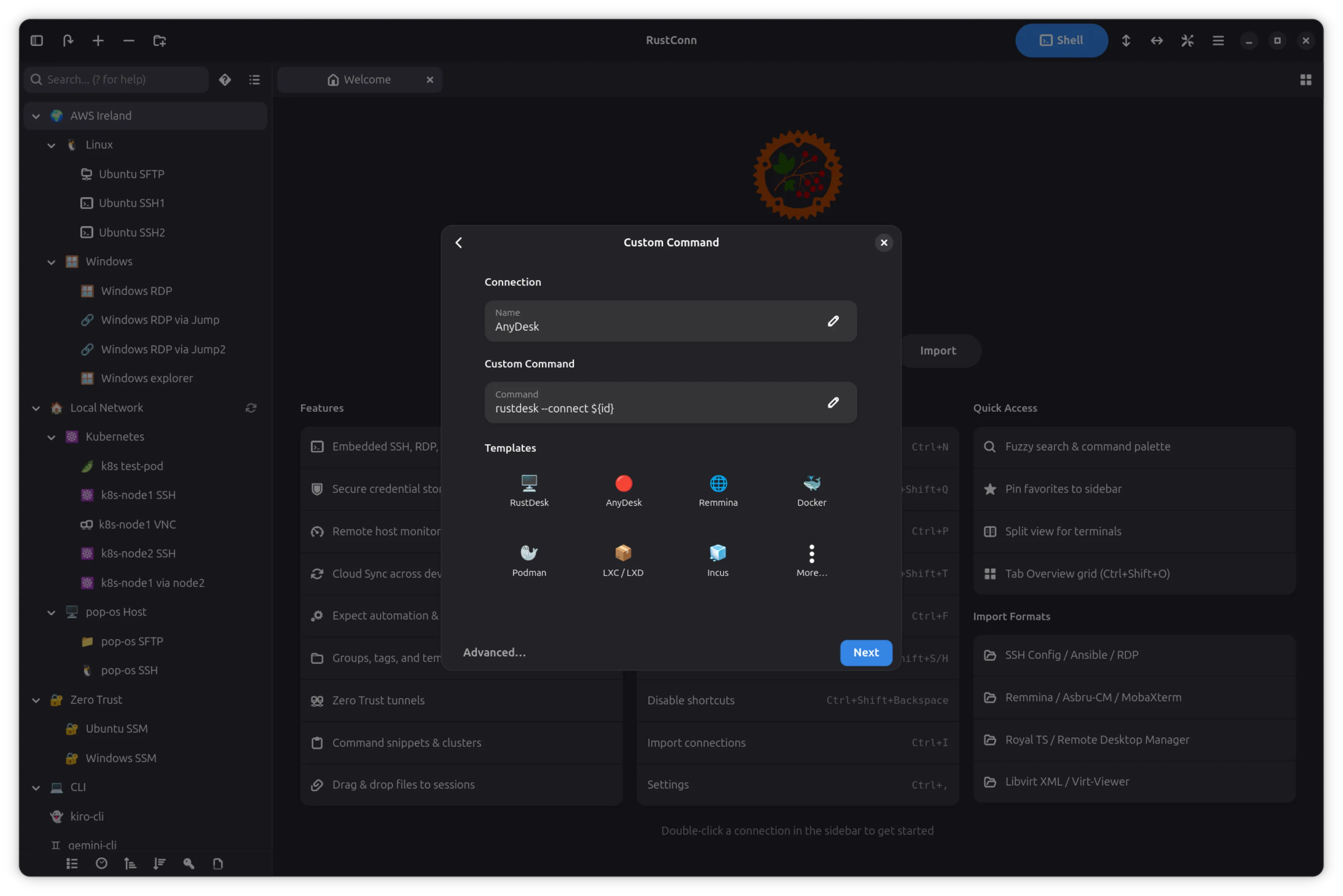
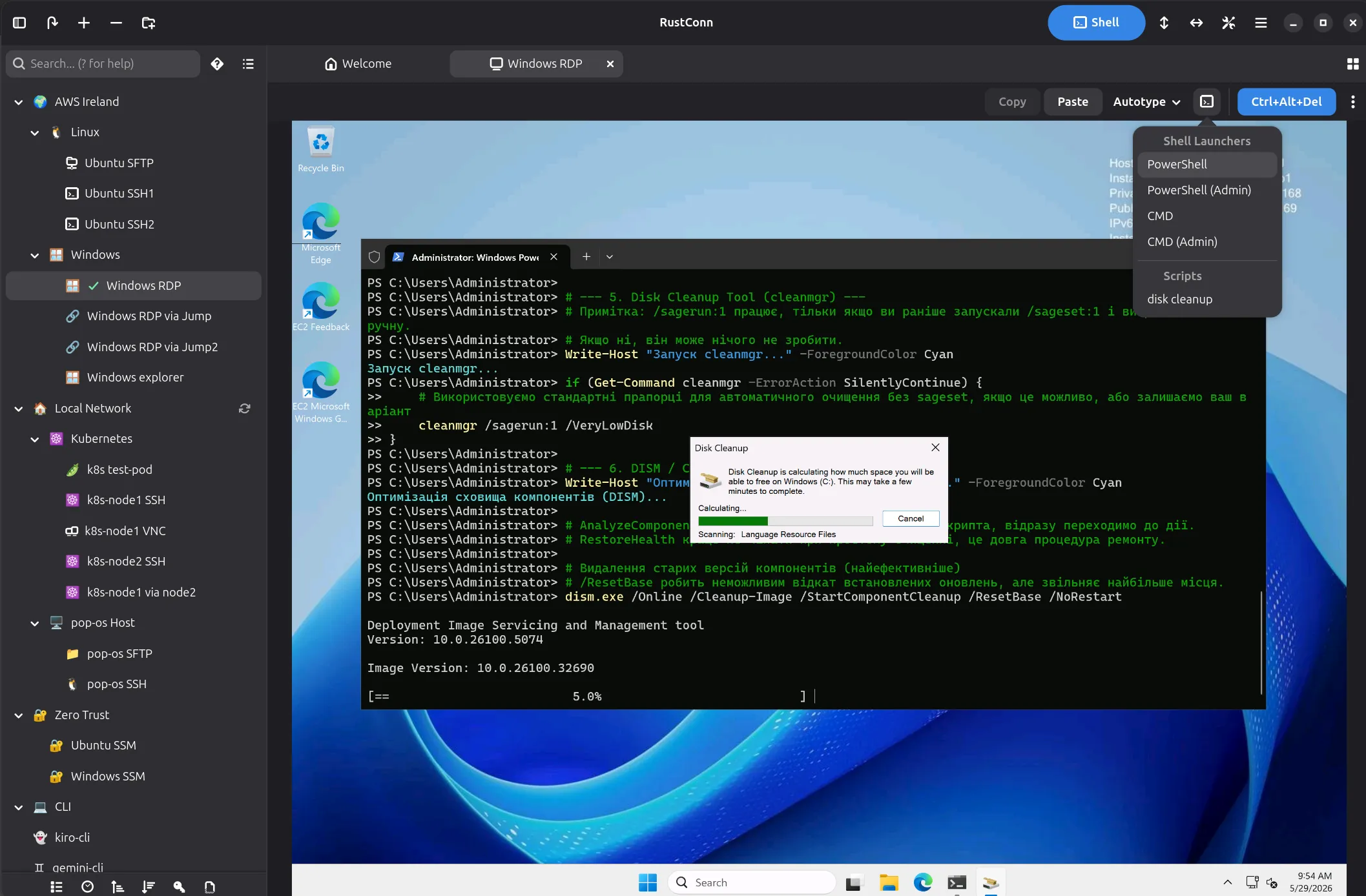
    RustConn (connection manager for SSH, RDP, VNC, SPICE, Telnet, Serial, Kubernetes, MOSH, and Zero Trust protocols)

    Versions 0.10.15–0.10.22 bring a week of polish across the UI, security, and terminal experience.

    Terminal got better. Font zoom (Ctrl+Scroll, Ctrl+Plus/Minus) and optional copy-on-select landed. The context menu now works properly — VTE’s native API replaced the custom popover that was stealing focus and breaking clipboard actions. On X11 sessions (MATE, XFCE) where GTK4’s NGL renderer caused blank popovers, RustConn auto-detects and falls back to Cairo.

    Sidebar and navigation. Groups expand/collapse on double-click anywhere on the row. The Local Shell button moved to the header bar so it’s always visible. Protocol filter bar is now optional and togglable. Tab groups show as a [GroupName] prefix in the tab title, and a new “Close All in Group” action cleans up grouped tabs at once. A tab group chooser dialog with clickable pill buttons replaces manual retyping.

    RDP fixes. Multiple shared folders now map correctly in embedded IronRDP mode — previously only the first path was used. SSH Port Forwarding UI, which had silently disappeared from the connection dialog, is back.

    Security hardened. Machine key encryption dropped the predictable hostname+username fallback; the /etc/machine-id path now uses HKDF-SHA256 with app-specific salt. Context menu labels and sidebar accessible labels are localized for screen readers.

    Ctrl+K no longer hijacks the terminal — it was removed from the global search shortcut, so nano and other terminal apps get it back. Terminal auto-focus after connection means you can type immediately.

    Export and import. Export dialog gained a group filter, and RustConn Native (.rcn) is now the default format in both import and export dialogs.

    Project: https://github.com/totoshko88/RustConn Flatpak: https://flathub.org/en/apps/io.github.totoshko88.RustConn

    main_white_en.LE8jVXnl_ZiloOX.webp

    Mufeed Ali reports

    Wordbook 1.0.0 was released

    Wordbook is now a fully offline application with no in-app downloads. Pronunciation data is now sourced from WordNet where possible, allowing better grouping of definitions in homonyms like “bass”. In general, many UI/UX improvements and bug fixes were also made. The community also helped by localizing the app for a total of 6 new languages.

    Try it on Flathub .

    Pods

    Keep track of your podman containers.

    marhkb says

    Pods 3.0.0 is out!

    This major release introduces a brand-new container engine abstraction layer allowing for greater flexibility.

    Based on this new layer, Pods now features initial Docker support, making it easier for users to manage their containers regardless of their preferred backend.

    Check it out on Flathub .

    Pods.DXGbuqN1_KYyow.webp

    That’s all for this week!

    See you next week, and be sure to stop by #thisweek:gnome.org with updates on your own projects!

    • Pl chevron_right

      Thibault Martin: TIL that Pagefind does great client-side search

      news.movim.eu / PlanetGnome • 16 April 2026

    I post more and more content on my website. What was visible at glance then is now more difficult to look for. I wanted to implement search, but it is a static website. It means that everything is built once, and then published somewhere as final, immutable pages. I can't send a request for search and get results in return.

    Or that's what I thought! Pagefind is a neat javascript library that does two things:

    1. It produces an index of the content right after building the static site.
    2. It provides 2 web components to insert in my pages: <pagefind-modal> that is the search modal itself, hidden by default, and <pagefind-modal-trigger> that looks like a search field and opens the modal.

    The pagefind-modal component looks up the index when the user types a request. The index is a static file, so there is not need for a backend that processes queries. Of course this only works for basic queries, but it's a great rool already!

    Pagefind is also easy to customize via a list of CSS variables . Adding it to this website was very straightforward.

    • Pl chevron_right

      Thibault Martin: I realized that Niri can have gorgeous animation

      news.movim.eu / PlanetGnome • 15 April 2026 • 1 minute

    I was a huge fan of Niri already. It's a scrolling tiling window manager. Roughly:

    • When I open an app it takes the full height and a pre-configured width on the screen.
    • When I open more apps and the screen was already full, it pushes the existing apps off screen.
    • It can stack windows in columns to have a more compact view

    It means that windows always take the optimal amount of space, and they're very neatly organized. It's extremely pleasant to use and keyboard friendly.

    Don't mind the apparent slowness: this was recorded on a 10 year old laptop, opening OBS is enough to make its CPU go brr. When OBS is not running, Niri is buttery smooth.

    But now I've learned that Niri supports user-provided GLSL shaders for several animations. Roughly: you can animate how windows appear and disappear (and other events, but let's keep things simple).

    Some people out there have created collections of shaders that work wonderfully for Niri:

    My personal favorite is the glitchy one.

    In a world of uniform UIs, these frivolous, unnecessary and creative ways to interact with users are a breath of fresh air! Those animations are healing my inner 14 year old.

    • Pl chevron_right

      Steven Deobald: End of 10 Handout

      news.movim.eu / PlanetGnome • 14 April 2026 • 1 minute

    There was a silly little project I’d tried to encourage many folks to attempt last summer. Sri picked it up back in September and after many months, I decided to wrap it up and publish what’s there.

    The intention is a simple, 2-sided A4 that folks can print and give out at repair cafes, like the End of 10 event series. Here’s the original issue , if you’d like to look at the initial thought process.

    When I hear fairly technical folks talk about Linux in 2026, I still consistently hear things like “I don’t want to use the command line.” The fact that Spotify, Discord, Slack, Zoom, and Steam all run smoothly on Linux is far removed from these folks’ conception of the Linux desktop they might have formed back in 2009. Most people won’t come to Linux because it’s free of ✨ shlop ✨ and ads — they’re accustomed to choking on that stuff. They’ll come to Linux because they can open a spreadsheet for free, play Slay The Spire 2, or install Slack even though they promised themselves they wouldn’t use their personal computer for work.

    The GNOME we all know and love is one we take for granted… and the benefits of which we assume everyone wants. But the efficiency, the privacy, the universality, the hackability, the gorgeous design, and the lack of ads? All these things are the icing on the cake. The cake, like it or not, is installing Discord so you can join the Sunday book club.

    Here’s the A4 . And here’s a snippet:

    An A4 snippet including "where's the start menu?", "where are my exes?", and "how do I install programs?"

    If you try this out at a local repair cafe, I’d love to know which bits work and which don’t. Good luck! ❤

    • Pl chevron_right

      Sjoerd Stendahl: Announcing the upcoming Graphs 2.0

      news.movim.eu / PlanetGnome • 14 April 2026 • 8 minutes

    It’s been a while since we last shared a major update of Graphs. We’ve had a few minor releases, but the last time we had a substantial feature update was over two years ago.

    This does not mean that development has stalled, to the contrary. But we’ve been working hard on some major changes that took some time to get completely right. Now after a long development cycle, we’re finally getting close enough to a release to be able to announce an official beta period. In this blog, I’ll try to summarize most of the changes in this release.

    New data types

    In previous version of Graphs, all data types are treated equally. This means that an equation is actually just regular data that is generated when loading. Which is fine, but it also means that the span of the equation is limited, the equation cannot be changed afterward, and operations on the equation will not be reflected in the equation name. In Graphs 2.0, we have three distinct data types: Datasets, Generated Datasets and Equations.

    Datasets are the regular, imported data that you all know and love. Nothing really has changed here. Generated Datasets are essentially the same as regular datasets, but the difference is that these datasets are generated from an equation. They work the same as regular datasets, but for generated datasets you can change the equation, step size and the limits after creating the item. Finally, the major new addition is the concept of equations. As the name implies, equations are generated based on an equation you enter, but they span an infinite range. Furthermore, operations you perform on equations are done analytically. Meaning if you translate the equation `y = 2x + 3` with 3 in the y-direction, it will change to `y = 2x + 6`. If you perform a derivative, the equation will change to `y = 2x` etcetera. This is a long-requested feature, and has been made possible thanks to the magic of sympy and some trickery on the canvas. Below, there’s a video that demonstrates these three data types.

    Revamped Style Editor

    We have redesigned the style editor, where we now show a live preview of the edited styles. This has been a pain point in the past, when you edit styles you cannot see how it actually affects the canvas. Now the style editor immediately tells you how it will affect a canvas, making it much easier to change the style exactly to your preferences.

    We have also added the ability to import styles. Since Graphs styles are based on matplotlib styles, most features from a matplotlib style generally work. Similarly, you can now export your styles as well making it easier to share your style or simply to send it to a different machine. Finally, the style editor can be opened independently of Graphs. By opening a Graphs style from your file explorer, you can change the style without having to open Graphs.

    We also added some new options, such as the ability to style the new error bars. But also the option to draw tick labels (so the values) on all axes that have ticks.

    A screenshot of the Graphs style editor, on the left you can see the different settings as in the previous version. On the right you can see the live preview The revamped style editor

    Improved data import

    We have completely reworked the way data is imported. Under the hood, our modules are completely modular making it possible to add new parsers without having to mess with the code. Thanks to this rework, we have added support for spreadsheets (LibreOffice .ods and Microsoft Office .xlxs) and for sqlite databases files. The UI automatically updates accordingly. For example for spreadsheets, columns are imported by the column name (alphabetical letter) instead of an index, while sqlite imports show the tables present in the database.

    The new import dialog for Graphs. You can see how multiple different types of items are about the be imported, as well as new settings The new import dialog

    Furthermore, the import dialog has been improved. It is not possible to add multiple files at once, or import multiple datasets from the same file. Settings can be adjusted for each dataset individually. And you can even import just from a single column. We also added the ability to import error-bars on either axes, and added some pop-up buttons that explain certain settings.

    Error bars

    I mentioned this in the previous paragraph, but as it’s a feature that’s been requested multiple times I thought it’d be good to state this explicitly as well. We now added support for error bars. Error bars can easily be set on the import dialog, and turned on and off for each axis when editing the item.

    Reworked Curve fitting

    The curve fitting has been reworked completely under the hood. While the changes may not be that obvious as a user, the code has basically been completely replaced. The most important change is that the confidence band is now calculated completely correctly using the delta-method. Previously a naive approach was used where the limits were calculated using the standard deviation each parameter. This does not hold up well in most cases though. The parameter values that are given are also no longer rounded in the new equation names (e.g. 421302 used to be rounded to 421000). More useful error messages are provided when things go wrong, custom equations now have an apply button which improves smoothness when entering new equations, the root mean squared error is added as a second goodness-of-fit measure, you can now check out the residuals of your fit. The residuals can be useful to check if your fit is physically correct. A good fit will show residuals scattered randomly around zero with no visible pattern. A systematic pattern in the residuals, such as a curve or a trend suggests that the chosen model may not be appropriate for the data.

    The old version of Graphs with the naive calculation of the confidence band The new version of Graphs with the proper calculation of the confidence band.

    UI changes

    We’ve tweaked the UI a bit all over the place. But one particular change that is worth to highlight, is that we have moved the item and figure settings to the sidebar. The reason for this, is that the settings are typically used to affect the canvas so you don’t want to lose sight of how your setting affects the canvas while you’re updating. For example, when setting the axes limits, you want to see how your graph looks with the new limit, having a window obstructing the view does not help.

    Another nice addition is that you can now simply click on a part of the canvas, such as the limits, and it will immediately bring you to the figure settings with the relevant field highlighted. See video below.

    Mobile screen support

    With the upcoming release, we finally have full support for mobile devices. See here a quick demonstration on an old OnePlus 6:

    https://cdn.masto.host/floss/media_attachments/files/115/731/446/400/973/237/original/036012181a618059.mp4

    Figure exporting

    One nice addition is the improved figure export. Instead of simply taking the same canvas as you see on the screen, you can now explicitly set a certain resolution. This is vital if you have a lot of figures in the same work, or need to publish your figures in academic journals, and you need consistency both in size and in font sizes. Of course, you can still use the previous setting and have the same size as in the application.

    The new export figure dialog

    More quality of life changes

    The above are just a highlight of some major feature updates. But there’s a large amount of features that we added. Here’s a rapid-fire list of other niceties that we added:

      • Multiple instances of Graphs can now be open at the same time
      • Data can now be imported by drag-and-drop
      • The subtitle finally shows the full file path, even in the isolated Flatpak
      • Custom transformations have gotten more powerful with the addition of new variables to use
      • Graphs now inhibits the session when unsaved data is still open
      • Added support for base-2 logarithmic scaling
      • Warnings are now displayed when trying to open a project from a beta version

    And a whole bunch of bug-fixes, under-the-hood changes, and probably some features I have forgotten about. Overall, it’s our biggest update yet by far, and I am excited to finally be able to share the update soon.

    As always, thanks to everyone who has been involved in this version. Graphs is not a one-person project. The bulk of the maintenance is done by me and Christoph, the other maintainer. And of course, we should thank the entire community. Both within GNOME projects (such as help from the design team, and the translation team), as well as outsiders that come with feedback, report or plain suggestions.

    Getting the beta

    This release is still in beta while we are ironing out the final issues. The expected release date is somewhere in the second week of may. In the meantime, feel free to test the beta. We are very happy for any feedback, especially in this period!

    You can get the beta directly from flathub. First you need to add the flathub beta remote:

    flatpak remote-add --if-not-exists flathub-beta https://flathub.org/beta-repo/flathub-beta.flatpakrepo

    Then, you can install the application:
    flatpak install flathub-beta se.sjoerd.Graphs

    To run the beta version by default, the following command can be used:

    sudo flatpak make-current se.sjoerd.Graphs beta

    Note that the sudo is neccesary here, as it sets the current branch on the system level. To install this on a per-user basis, the flag –user can be used in the previous commands. To switch back to the stable version simply run the above command replacing beta with stable.

    The beta branch on update should get updated somewhat regularly. If you don’t feel like using the flathub-beta remote, or want the latest build. You can also get the release from the GitLab page , and build it in GNOME Builder.

    • Pl chevron_right

      Jakub Steiner: 120+ Icons and Counting

      news.movim.eu / PlanetGnome • 14 April 2026 • 5 minutes

    Back in 2019, we undertook a radical overhaul of how GNOME app icons work. The old Tango-era style required drawing up to seven separate sizes per icon and a truckload of detail. A task so demanding that only a handful of people could do it. The "new" style is geometric, colorful, and most importantly — achievable . But redesigning the system was just the first step. We needed to actually get better icons into the hands of app developers, as those should be in control of their brand identity. That's where app-icon-requests came in.

    As of today, the project has received over a hundred icon requests. Each one represents a collaboration between a designer and a developer, and a small but visible improvement to the Linux desktop.

    How It Works

    Ideally if a project needs a quick turnaround and direct control over the result, the best approach remains doing it in-house or commission a designer.

    But if you're not in a rush, and aim to be a well designed GNOME app in particular, you can leverage the idle time of various GNOME designers. The process is simple. If you're building an app that follows the GNOME Human Interface Guidelines , you can open an icon request . A designer from the community picks up the issue, starts sketching ideas, and works with you until the icon is ready to ship. If your app is part of GNOME Circle or is aiming to join, you're far more likely to get a designer's attention quickly.

    The sketching phase is where the real creative work happens. Finding the right metaphor for what an app does, expressed in a simple geometric shape. It's the part I enjoy most, and why I've been sharing my Sketch Friday process on Mastodon for over two years now ( part 2 ). But the project isn't about one person's sketches. It's a team effort, and the more designers join, the faster the backlog shrinks.

    Highlights

    Here are a few of the icons that came through the pipeline. Each started as a GitLab issue and ended up as pixels on someone's desktop.

    Alpaca Bazaar Field Monitor Dev Toolbox Exhibit Plots Gradia Millisecond Orca Flatseal Junction Carburetor

    Alpaca , an AI chat client, went through several rounds of sketching to find just the right llama. Bazaar , an alternative to GNOME Software, took eight months and 16 comments to go from a shopping basket concept through a price tag to the final market stall. Millisecond , a system tuning tool for low-latency audio, needed several rounds to land on the right combination of stopwatch and waveform. Field Monitor shows how multiple iterations narrow down the concept. And Exhibit , the 3D model viewer, is one of my personal favorites.

    You can browse all 127 completed icons to see the full range — from core GNOME apps to niche tools on Flathub .

    Papers: From Sketch to Ship

    To give a sense of what the process looks like up close, here's Papers — the GNOME document viewer. The challenge was finding an icon that says "documents" without being yet another generic file icon.

    Papers concept sketch with magnifying glass Papers concept sketch width stacked papers Papers concept sketch with reading glasses Papers final icon

    The early sketches explored different angles — a magnifying glass over stacked pages, reading glasses resting on a document. The final icon kept the reading glasses and the stack of colorful papers, giving it personality while staying true to what the app does. The whole thing played out in the GitLab issue , with the developer and designer going back and forth until both were happy.

    While the new icon style is far easier to execute than the old high-detail GNOME icons, that doesn't mean every icon is quick. The hard part was never pushing pixels — it's nailing the metaphor. The icon needs to make sense to a new user at a glance, sit well next to dozens of other icons, and still feel like this app to the person who built it. Getting that right is a conversation between the designer's aesthetic judgment and the maintainer's sense of identity and purpose, and sometimes that conversation takes a while.

    Bazaar is a good example.

    Bazaar early concept - shopping basket Bazaar concept - price tag Bazaar concept - market stall Bazaar final icon

    The app was already shipping with the price tag icon when Tobias Bernard — who reviews apps for GNOME Circle — identified its shortcomings and restarted the process. That kind of quality gate is easy to understate, but it's a big part of why GNOME apps look as consistent as they do. Tobias is also a prolific icon designer himself, frequently contributing icons to key projects across the ecosystem. In this case, the sketches went from a shopping basket through the price tag to a market stall with an awning — a proper bazaar. Sixteen comments and eight months later, the icon shipped.

    Get Involved

    There are currently 20 open icon requests waiting for a designer. Recent ones like Kotoba (a Japanese dictionary), Simba (a Samba manager), and Slop Finder haven't had much activity yet and could use a designer's attention.

    If you're a designer, or want to become one, this is a great place to start contributing to Free software. The GNOME icon style was specifically designed to be approachable: bold shapes, a defined color palette, clear guidelines . Tools like Icon Preview and Icon Library make the workflow smooth. Pick a request, start with a pencil sketch on paper, and iterate from there. There's also a dedicated Matrix room #appicondesign:gnome.org where icon work is discussed — it's invite-only due to spam, but feel free to poke me in #gnome-design or #gnome for an invitation. If you're new to Matrix, the GNOME Handbook explains how to get set up.

    If you're an app developer , don't despair shipping with a placeholder icon. Follow the HIG , open a request , and a designer will help you out. If you're targeting GNOME Circle , a proper icon is part of the deal anyway.

    A good icon is one of those small things that makes an app feel real — finished, polished, worth installing. Now that we actually have a place to browse apps, an app icon is either the fastest way to grab attention or make people skip. If you've got some design chops and a few hours to spare, pick an issue and start sketching.

    Need a Fast Track?

    If you need a faster turnaround or just want to work with someone who's been helping out with GNOME's visual identity for as long as I can remember — Hylke Bons offers app icon design for open source projects through his studio, Planet Peanut. Hylke has been a core contributor to GNOME's icon work for well over a decade. You'll be in great hands.

    His service has a great freebie for FOSS projects — funded by community sponsors. You get three sketches to choose from, a final SVG, and a symbolic variant, all following the GNOME icon guidelines. If your project uses an OSI-approved license and is on Flathub, you're eligible. Consider sponsoring his work if you can — even a small amount helps keep the pipeline going.

    Previously , Previously .

    • Pl chevron_right

      Adrien Plazas: Monster World IV: Disassembly and Code Analysis

      news.movim.eu / PlanetGnome • 13 April 2026 • 2 minutes

    This winter I was bored and needed something new, so I spent lots of my free time disassembling and analysing Monster World IV for the SEGA Mega Drive. More specifically, I looked at the 2008 Virtual Console revision of the game, which adds an English translation to the original 1994 release.

    My long term goal would be to fully disassemble and analyse the game, port it to C or Rust as I do, and then port it to the Game Boy Advance. I don’t have a specific reason to do that, I just think it’s a charming game from a dated but charming series, and I think the Monaster World series would be a perfect fit on the Game Boy Advance. Since a long time, I also wanted to experiment with disassembling or decompiling code, understanding what doing so implies, understanding how retro computing systems work, and understanding the inner workings of a game I enjoy. Also, there is not publicly available disassembly of this game as far as I know.

    As Spring is coming, I sense my focus shifting to other projets, but I don’t want this work to be gone forever and for everyone, especially not for future me. Hence, I decided to publish what I have here, so I can come back to it later or so it can benefit someone else.

    First, here is the Ghidra project archive . It’s the first time I used Ghidra and I’m certain I did plenty of things wrong, feedback is happily welcome! While I tried to rename things as my understanding of the code grew, it is still quite a mess of clashing name conventions, and I’m certain I got plenty of things wrong.

    Then, here is the Rust-written data extractor . It documents how some systems work, both as code and actual documentation. It mainly extracts and documents graphics and their compression methods, glyphs and their compression methods, character encodings, and dialog scripts. Similarly, I’m not a Rust expert, I did my best but I’m certain there is area for improvement, and everything was constantly changing anyway.

    There is more information that isn’t documented and is just floating in my head, such as how the entity system works, but I yet have to refine my understanding of it. Same goes for the optimimzations allowed by coding in assembly, such as using specific registers for commonly used arguments. Hopefully I will come back to this project and complete it, at least when it comes to disassembling and documenting the game’s code.

    • Pl chevron_right

      Felipe Borges: RHEL 10 (GNOME 47) Accessibility Conformance Report

      news.movim.eu / PlanetGnome • 13 April 2026

    Red Hat just published the Accessibility Conformance Report (ACR) for Red Hat Enterprise Linux 10 .

    Accessibility Conformance Reports basically document how our software measures up against accessibility standards like WCAG and Section 508 . Since RHEL 10 is built on GNOME 47, this report is a good look at how our stack handles various accessibility things from screen readers to keyboard navigation.

    Getting a desktop environment to meet these requirements is a huge task and it’s only possible because of the work done by our community in projects like: Orca, GTK, Libadwaita, Mutter, GNOME Shell, core apps, etc…

    Kudos to everyone in the GNOME project that cares about improving accessibility . We all know there’s a long way to go before desktop computing is fully accessible to everyone, but we are surely working on that.

    If you’re curious about the state of accessibility in the 47 release or how these audits work, you can find the full PDF here .